


|
Navigation
Recherche
|
Apple’s Liquid Glass message is clear: The macOS 26 ‘redesign’ is an afterthought
mercredi 30 juillet 2025, 12:30 , par Macworld UK
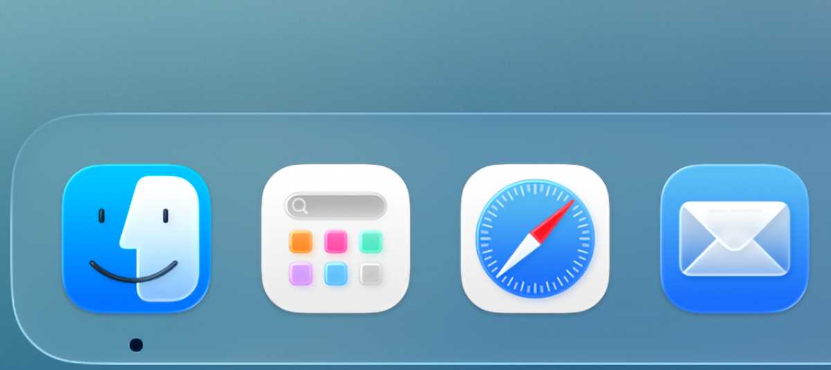
Apple’s OS 26 public betas are now out, marking another major milestone on the road to their release this fall. While all the social-media discourse has been about Apple’s new Liquid Glass design, that talk obscures some of Apple’s other interesting choices in this year’s operating system cycle. While Apple would probably insist (like a proud parent) that it doesn’t have favorites among its platforms, the choices Apple has made in this cycle say an awful lot about the company’s priorities, especially when it comes to the Mac. Living in glass houses Let’s start with the Liquid Glass design itself. The entire premise of this design is that Apple’s devices are largely featureless glass slabs, so creating a software interface that plays on the illusion that it’s actually a set of glass layers that slide in and out is a pretty clever one. (Your mileage may vary regarding whether Apple has executed this concept well in the current betas.) On the iPhone–Apple’s most important single product by an enormous margin–the metaphor really works. On the iPad, it’s a little more unfocused but not entirely unmoored from reality. On the Apple Watch and Apple TV it feels like window dressing. And on the Mac, which offers a glass screen as well as a big keyboard and trackpad that are used to interact indirectly with what’s on the screen, it just feels… off. The Liquid Glass effect works well on the iPhone, but not so well on the Mac. Foundry I acknowledge that finding a harmonious way to get a metaphor about a glass slab you hold in your hand to work on a traditional computer interface is a pretty tough task for any designer. And really, it’s fine: the iPhone is the most important product, and as much as I love my Mac, I have to acknowledge that the iPhone’s influence probably needs to be felt in every other product Apple creates. But still, it’s a tough pill to swallow. The redesign in macOS Tahoe is, unsurprisingly, focused on areas of commonality with iOS, like the Photos and Music apps. A Mac-only app like the Finder, or a very common Mac interface convention like window toolbars, have very obviously gotten much less attention. Depending on how you feel about Liquid Glass, you might consider it lucky that Apple has failed to do much more to the toolbars in Finder than put a drop shadow on a set of gray buttons. But to me it feels like a missed opportunity. This new design is the first time Apple has ever attempted to roll out a single design language across all of its platforms at once, which could have created a lot of harmony between the Mac and Apple’s other platforms that just feels missing, at least in the Public Beta. The foundational interface theme for Mac OS X was Aqua. The more I think about it, the more I think that the Liquid Glass era could potentially lead to a modern take on Aqua for the Mac: clear glass, instead of blue tints everywhere, and no pinstripes, but… I try to imagine toolbar buttons on the Mac feeling a bit more like the glass droplets they’re supposed to be, and it brings Aqua to mind. I would love to see Apple try something like that. Unfortunately, it seems Apple’s far too focused on the iPhone’s design to spend the time bringing a separate (but familial!) design to the Mac. I understand why, but as a Mac user I don’t have to like it. Where work gets done And yet, despite my disappointment about the design, I think macOS Tahoe is going to be one of the best Mac upgrades in years. That’s because while Apple’s design priorities have been laid bare, so too have its priorities when it comes to productivity. Steve Jobs famously likened the Mac to trucks, specialty tools used to help people get work done. That spirit lives on in macOS Tahoe, which–alongside that lackluster set of interface tweaks–imports more power-user features in one version than we’ve seen in ages. Start with Spotlight, which has been gradually improving since it was introduced in macOS Tiger and now features a clipboard history, actions powered by App Intents and Shortcuts, and even customizable Quick Keys to quickly trigger actions. It’s powerful enough that I’ve stopped using my launching utility from a couple of decades ago. Spotlight’s support for app intents and Shortcuts make it a powerful interface toolJason Snell Then there’s Shortcuts, which adds deep support for automation. Automations have been available in Shortcuts on iOS for years, and now the Mac has picked up all of those triggers–but also an entire new set of automation types that allow Shortcuts to run when a folder or file is modified or when an external drive connects. Back in the day–OS X 10.2 Jaguar to be specific–Apple introduced the concept of Folder Actions, which let you run AppleScript scripts when stuff changed on your Mac. Shortcuts just brought that feature back, but now it’s turbocharged by everything Shortcuts can do. I’ve already wired up several Shortcuts to trigger when items are added to my Downloads folder, my Desktop, and when I trigger a Focus Mode. There will be many, many more. Perhaps the best example of Apple taking a feature from its other platforms and building the right version of it for the Mac is Control Center. Yes, I know, in recent versions of macOS the Control Center has felt a little foreign–a shoe that fits, but uncomfortably. In Tahoe, though, Apple has finally shown its cards: Control Center on the Mac is the centerpiece of a new strategy to let users customize and manage our menu bar as we see fit. Key to the strategy is the Controls API, which lets any app write items that can appear in Control Center. That’s a nice start, but also consider that Controls can be placed in Control Center or on the menu bar. Apps that want to let users get quick access to actions or view information can now write Controls, and let their users decide if those Controls should be prominently displayed in the menu bar or tucked away in Control Center. Control Center has more flexibility, which makes it feel more Mac-like and less like an iOS import.Foundry On top of that, Apple has taken the iOS concept of a multi-paged Control Center to instead allow users to add extra Control Center menus to the menu bar, complete with icons chosen by the user. You can populate different Control Center menus with different Controls, organized how you like. You probably see where this is going: Apple’s basically building a menu bar manager into macOS itself, which is helpful given the limited space on laptop screens (especially those with a big notch in the center). Existing Menu Extras won’t work with this new system, so Apple will need developers to adopt this new approach, but I appreciate how this approach feels attuned to how important the menu bar is on the Mac. Be yourself A good parent is never going to name a favorite child, because it’s a foolish concept that misses all the nuances–you love your kids for who they are, and every kid is unique. When Apple is at its best as a steward of its platforms, it’s treating each one as unique, too. The strengths of one are not the strengths of another. While there certainly is a family resemblance, the iPhone and the Mac are really very different, and that’s okay. While I might not be thrilled with how the Liquid Glass design concept has been halfheartedly implemented by Apple in the macOS Tahoe Public Beta, another way to look at this cycle is that Apple has focused on what the Mac is, and what it does best: It’s a productivity platform that ought to get new productivity features. The improvements to Spotlight, Shortcuts, and Control Center all feel like good additions that will make the Mac better at what it does, what we all need it to be. At least in this case, it feels like Apple’s priorities are in the right order.
https://www.macworld.com/article/2862474/macos-tahoe-prioritizes-productivity-over-liquid-glass.html
Voir aussi
|

59 sources (15 en français)
Date Actuelle
jeu. 31 juil. - 09:31 CEST
|
